
Sweater Season: Behind the NY Islanders Third Jersey

by Paul O’Dea, Sr. Art Director
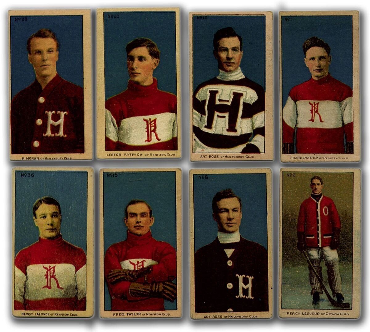
It’s Fall, and it’s getting cold, which means it's sweater season—or should we say jersey season? Traditionally the word “jersey” refers to an item of knitted clothing, usually made from wool or cotton and often used as sports apparel. But “sweaters” were actually the original name for hockey jerseys. In fact, when the NHL began in the early 1900s…”
Sports apparel has changed significantly since the 19th century, not only in the name of the threads, but in the look of them as well. Throughout the years, graphic design has consistently played a key role in revitalizing team attire and keeping things interesting. Uniforms serve an important purpose for teams, organizations and fans, beyond telling teams apart from one another. The logo, team colors and hidden images in a jersey can help relay special meanings, creating a graphic conversation between the design and the fans.
A look behind the late-night curtain…
No detail is unimportant when it comes to creating a design that will be seen by millions of people around the nation, night after night during the hockey season. Designers must carefully choose the logo and color scheme in order to create the most impactful, compelling and ultimately badass jersey for all to see. Once a team announces a new jersey release, every fan, friend, and community member has an opinion on the latest collection of details representing their home team. The greater the design, the better the trash-talking gets regardless of the team’s record that year. This boosts morale for the fans and brings in more money for the franchise. It’s a win-win situation!
The greatest appearance of a new jersey is the third, or alternate jersey. Prior to 1995, NHL teams primarily wore only two jerseys; one light and one dark. The 1995-1996 third-sweater program provided an opportunity for teams to further experiment by creating a slight variation of their franchise jersey design.
In 2017, Adidas had been named the new and official uniform provider of the NHL. Under Adidas, there were no third “alternate” jerseys created for any NHL teams in the 2017-2018 season. The NY Islanders saw an opportunity to change this by teaming up with Adjective and Co. to create a “third jersey” for the 2018 season–a design that would be added to the history of NY Islanders jerseys, and a huge opportunity for the Adjective and Co. team.
Since the franchise began in 1972, the Islanders have kept a pretty classic look – a variation of white, orange and royal blue. Until the early ‘90s, there had been real limits on how inventive you could get with hockey jersey designs. This was largely because all the details, numbers, names and logos had to be taken into consideration, and adding multiple complicated graphics would have required a massive amount of embroidery. Any additional thread would also add extra weight, making the jersey hotter to wear.
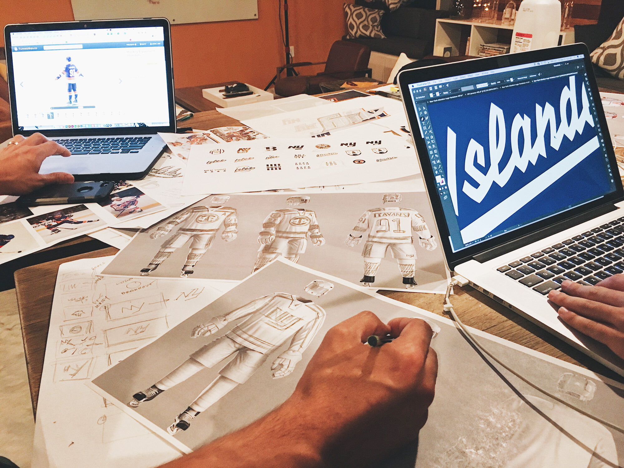
It was a new day for uniform design when computer programs like Photoshop and Illustrator were released, allowing creatives to dream up fresh logo designs without the extra embroidery. This was due to a new technique which allowed designs to be printed directly onto a jersey, called dye sublimation. For the first time, you could create a design in Photoshop, make it big, change its colors, and print directly onto the material without the concern of extra weight. Once this process became accessible, jersey designs in all sports became more detail-oriented. Designers were able to add the smallest details that made for greater impacts, and resulted in outrageous designs.
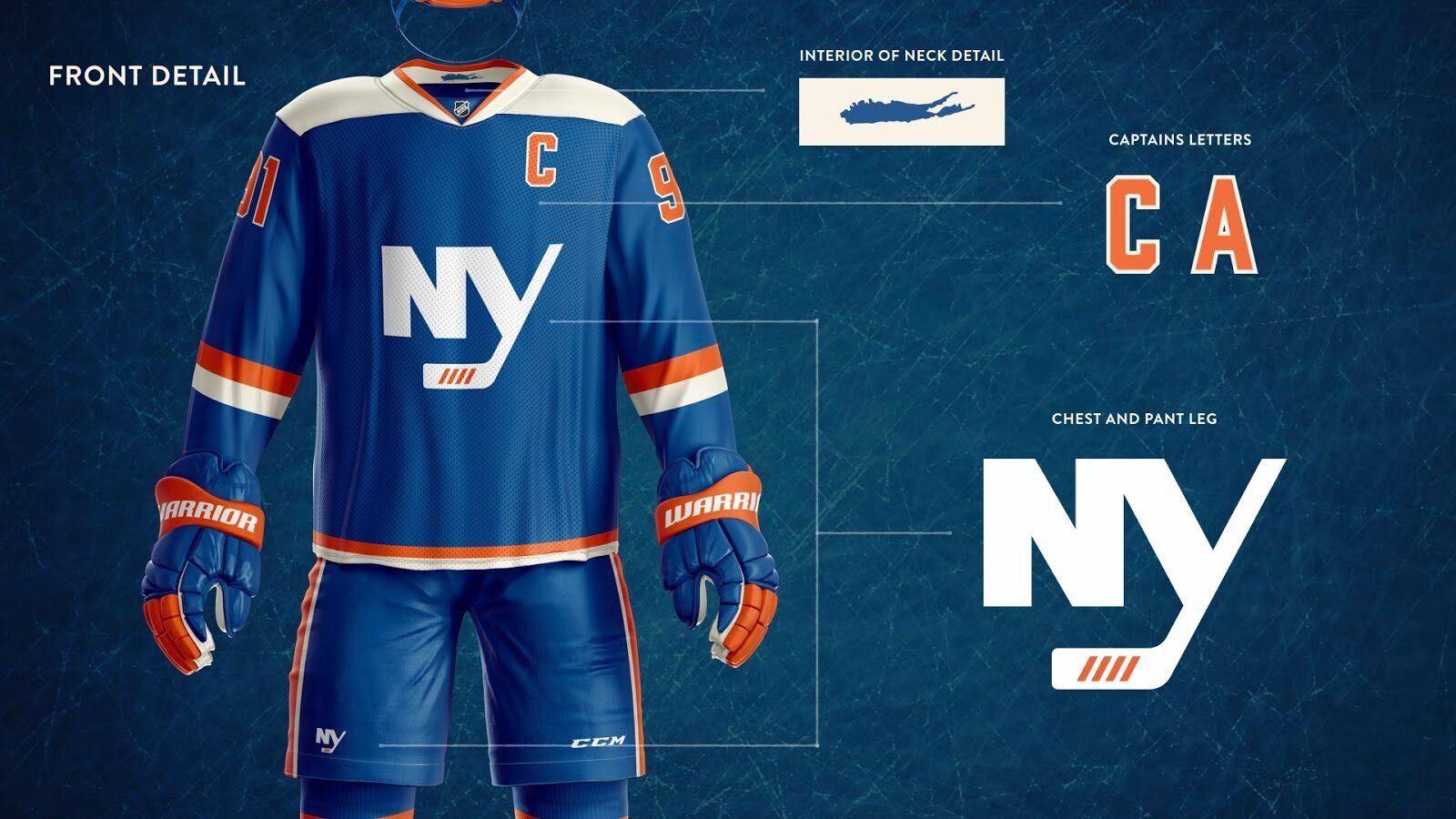
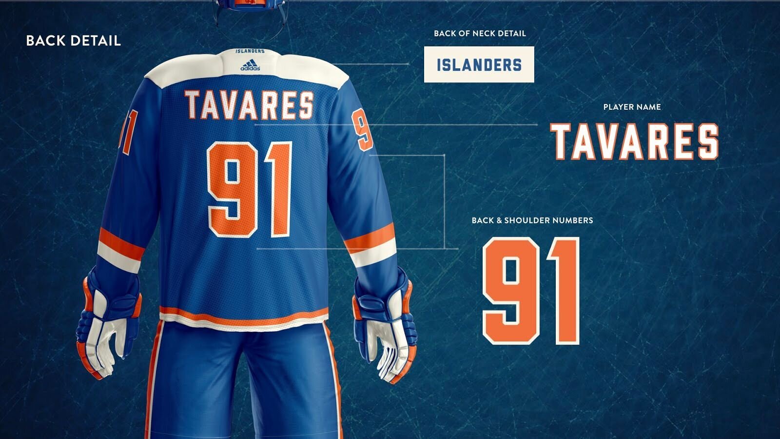
For the NY Islanders third jersey that our team created, the concept started at the drawing board. We explored several ways to represent the Islanders team history and tradition all within the third jersey design. Starting with the New York initials, the Y works both as a part of NY, as well as the tail of the hockey stick. We also crafted the N to read more easily, made larger counters and thickened the stick leading to a more uniform look overall (See what I did there). We added the fourth stripe of tape at the bottom tail of the Y, representing the blade of the stick, and resembling the 4 Stanley Cups won in a row that no other team has ever been able to achieve. At the interior of the neck, a small long island detail was added. At the back of the neck, the team name, “Islanders” stood bold in blue. The clean and sophisticated look was designed to give both players and fans the confidence they need for years to come.
This year, the team made it to the Eastern Conference championship, but fell short to the Stanley Cup champions. The team seems to be trending upwards after an unusual season of hockey. Hockey fans and players alike are looking forward to what third jerseys are in store in the upcoming years, and we can always count on graphic design to push the boundaries and give the people something exciting to look forward to.